Data analysis is thinking, data analysis is theorizing

There is a popular adage about academic writing: “Writing is thinking.” The idea is this: There is a simple view of writing as just an expressive process – the ideas already exist in your mind and you are just putting them on a page. That may in fact be true some of the time, like for day-to-day emails or texting friends or whatever. But “writing is thinking” reminds us that for most scholarly work, the process of writing is a process of continued deep engagement with the world of ideas. Sometimes before you start writing you think you had it all worked out in your head, or maybe in a proposal or outline you wrote. But when you sit down to write the actual thing, you just cannot make it make sense without doing more intellectual heavy lifting. It’s not because you forgot, it’s not because you “just” can’t find the right words. It’s because you’ve got more thinking to do, and nothing other than sitting down and trying to write is going to show that to you.*

Something that is every bit as true, but less discussed and appreciated, is that in the quantitative sciences, the same applies to working with data. Data analysis is thinking. The ideas you had in your head, or the general strategy you wrote into your grant application or IRB protocol, are not enough. If that is all you have done so far, you almost always still have more thinking to do.

This point is exemplified really well in the recent Many Analysts, One Data Set paper. Twenty-nine teams of data analysts were given the same scientific hypothesis to test and the same dataset to test it in. But no two teams ran the same analysis, resulting in 29 different answers. This variability was neither statistical noise nor human error. Rather, the differences in results were because of different reasoned decisions by experienced data analysts. As the authors write in the introduction:

In the scientific process, creativity is mostly associated with the generation of testable hypotheses and the development of suitable research designs. Data analysis, on the other hand, is sometimes seen as the mechanical, unimaginative process of revealing results from a research study. Despite methodologists’ remonstrations…, it is easy to overlook the fact that results may depend on the chosen analytic strategy, which itself is imbued with theory, assumptions, and choice points.

The very end of the quote drives home a second, crucial point. Data analysis is thinking, but it is something else too. Data analysis is theorizing. And it is theorizing no matter how much or how little the analyst is thinking about it.

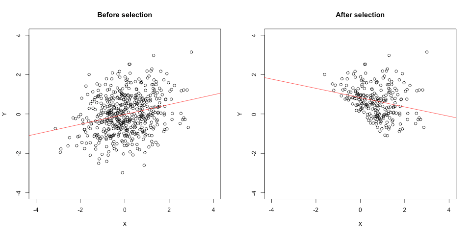
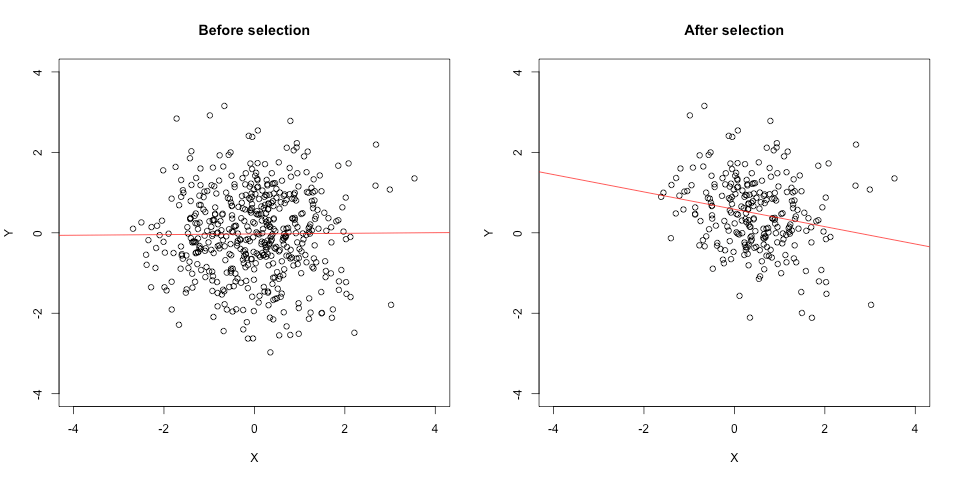
Scientific theory is not your mental state. Scientific theory consists of statements about nature. When, say, you decide on a scheme for how to exclude outliers in a response-time task, that decision implies a theory of which observations result from processes that are irrelevant to what you are studying and therefore ignorable. When you decide on how to transform variables for a regression, that decision implies a theory of the functional form of the relationships between measured variables. These theories may be longstanding ones, well-developed and deeply studied in the literature. Or they may be ad hoc, one-off implications. Moreover, the content of the analyst’s thinking may be framed in theoretical terms (“hmmm let me think through what’s generating this distribution”), or it may be shallow and rote (“this is how my old advisor said to trim response times”). But the analyst is still making decisions** that imply something about something in nature – the decisions are “imbued with theory.” That’s why scientists can invoke substantive reasons to critique each other’s analyses without probing each other’s mental states. “That exclusion threshold is too low, it excludes valid trials” is an admissible argument, and you don’t have to posit what was in the analyst’s head when you make it.

So data analysis decisions imply statements in theory-space, and in order to think well about them we probably need to think in that space too. To test one theory of interest, the process of data analysis will unavoidably invoke other theories. This idea is not, in fact, new. It is a longstanding and well-accepted principle in philosophy of science called the Duhem-Quine thesis. We just need to recognize that data analysis is part of that web of theories.

This gives us an expanded framework to understand phenomena like p-hacking. The philosopher Imre Lakatos said that if you make a habit of blaming the auxiliaries when your results don’t support your main theory, you are in what he called a degenerative research programme. As you might guess from the name, Imre wasn’t a fan. When we p-hack – try different analysis specifications until we get one we like – we are trying and discarding different configurations of auxiliary theories until we find one that lets us draw a preferred conclusion. We are doing degenerative science, maybe without even realizing it.

On the flip side, this is why preregistration can be a deeply intellectually engaging and rewarding process.*** Because without the data whispering in your ear, “Try it this way and if you get an asterisk we can go home,” you have one less shortcut around thinking about your analysis. You can, of course, leave the thinking until later. You can do so with full awareness and transparency: “This is an exploratory study, and we plan to analyze the data interactively after it is collected.” Or you can fool yourself, and maybe others, if you write a vague or partial preregistration. But if you commit to planning your whole data analysis workflow in advance, you will have nothing but thinking and theorizing to guide you through it. Which, sooner or later, is what you’re going to have to be doing.


* Or, you can write it anyway and not make sense, which also has a parallel in data analysis.
** Or outsourcing them to the software developer who decided what defaults to put in place.
*** I initially dragged my heels on starting to preregister – I know, I know – but when I finally started doing it with my lab, we experienced this for ourselves, somewhat to my own surprise.

Everything is fucked: The syllabus

PSY 607: Everything is Fucked
Prof. Sanjay Srivastava
Class meetings: Mondays 9:00 – 10:50 in 257 Straub
Office hours: Held on Twitter at your convenience (@hardsci)

In a much-discussed article at Slate, social psychologist Michael Inzlicht told a reporter, “Meta-analyses are fucked” (Engber, 2016). What does it mean, in science, for something to be fucked? Fucked needs to mean more than that something is complicated or must be undertaken with thought and care, as that would be trivially true of everything in science. In this class we will go a step further and say that something is fucked if it presents hard conceptual challenges to which implementable, real-world solutions for working scientists are either not available or routinely ignored in practice.

The format of this seminar is as follows: Each week we will read and discuss 1-2 papers that raise the question of whether something is fucked. Our focus will be on things that may be fucked in research methods, scientific practice, and philosophy of science. The potential fuckedness of specific theories, research topics, etc. will not be the focus of this class per se, but rather will be used to illustrate these important topics. To that end, each week a different student will be assigned to find a paper that illustrates the fuckedness (or lack thereof) of that week’s topic, and give a 15-minute presentation about whether it is indeed fucked.

Grading:

20% Attendance and participation
30% In-class presentation
50% Final exam

Week 1: Psychology is fucked

Meehl, P. E. (1990). Why summaries of research on psychological theories are often uninterpretable. Psychological Reports, 66, 195-244.

Week 2: Significance testing is fucked

Cohen, J. (1990). Things I have learned (so far). American Psychologist, 45, 1304-1312.

Rouder, J. N., Morey, R. D., Verhagen, J., Province, J. M., & Wagenmakers, E. J. (2016). Is there a free lunch in inference? Topics in Cognitive Science, 8, 520-547.

Week 3: Causal inference from experiments is fucked

Chapter 3 from: Bollen, K. A. (1989). Structural equations with latent variables. New York: Wiley.

Week 4: Mediation is fucked

Bullock, J. G., Green, D. P., & Ha, S. E. (2010). Yes, but what’s the mechanism?(don’t expect an easy answer). Journal of Personality and Social Psychology, 98, 550-558.

Week 5: Covariates are fucked

Culpepper, S. A., & Aguinis, H. (2011). Using analysis of covariance (ANCOVA) with fallible covariates. Psychological Methods, 16, 166-178.

Westfall, J., & Yarkoni, T. (2016). Statistically controlling for confounding constructs is harder than you think. PloS one, 11, e0152719.

Week 6: Replicability is fucked

Pashler, H., & Harris, C. R. (2012). Is the replicability crisis overblown? Three arguments examined. Perspectives on Psychological Science, 7, 531-536.

Open Science Collaboration. (2015). Estimating the reproducibility of psychological science. Science, 349(6251), aac4716.

Week 7: Interlude: Everything is fine, calm the fuck down

Gilbert, D. T., King, G., Pettigrew, S., & Wilson, T. D. (2016). Comment on “Estimating the reproducibility of psychological science.” Science, 251, 1037a.

Maxwell, S. E., Lau, M. Y., & Howard, G. S. (2015). Is psychology suffering from a replication crisis? What does “failure to replicate” really mean? American Psychologist, 70, 487-498.

Week 8: Scientific publishing is fucked

Fanelli, D. (2011). Negative results are disappearing from most disciplines and countries. Scientometrics, 90, 891-904.

Ioannidis, J. P. (2005). Why most published research findings are false. PLoS Med, 2, e124.

Week 9: Meta-analysis is fucked

Inzlicht, M., Gervais, W., & Berkman, E. (2015). Bias-Correction Techniques Alone Cannot Determine Whether Ego Depletion is Different from Zero: Commentary on Carter, Kofler, Forster, & McCullough, 2015. Available at SSRN: http://ssrn.com/abstract=2659409 or http://dx.doi.org/10.2139/ssrn.2659409

Van Elk, M., Matzke, D., Gronau, Q. F., Guan, M., Vandekerckhove, J., & Wagenmakers, E. J. (2015). Meta-analyses are no substitute for registered replications: A skeptical perspective on religious priming. Frontiers in Psychology, 6.

Week 10: The scientific profession is fucked

Bakker, M., van Dijk, A., & Wicherts, J. M. (2012). The rules of the game called psychological science. Perspectives on Psychological Science, 7, 543-554.

Nosek, B. A., Spies, J. R., & Motyl, M. (2012). Scientific utopia II. Restructuring incentives and practices to promote truth over publishability. Perspectives on Psychological Science, 7, 615-631.

Finals week

Wear black and bring a #2 pencil.

Statistics as math, statistics as tools

frame

How do you think about statistical methods in science? Are statistics a matter of math and logic? Or are they a useful tool? Over time, I have noticed that these seem to be two implicit frames for thinking about statistics. Both are useful, but they tend to be more common in different research communities. And I think sometimes conversations get off track when people are using different ones.

Frame 1 is statistics as math and logic. I think many statisticians and quantitative psychologists work under this frame. Their goal is to understand statistical methods, and statistics are based on math and logic. In math and logic, things are absolute and provable. (Even in statistics, which deals with uncertainty, the uncertainty is almost always quantifiable, and thus subject to analysis.) In math and logic, exceptions and boundary cases are important. If I say “All A are B” and you disagree with me, all you need to do is show me one instance of an A that is not B and you’re done.

In the realm of statistics, that can mean either proving or demonstrating that a method breaks down under some conditions. A good example of this is E. J. Wagenmakers et al.’s recent demonstration that using intervals to do hypothesis testing is wrong. Many people (including me) have assumed that if the 95% confidence interval of a parameter excludes 0, that’s the same as falsifying the hypothesis “parameter = 0.” E. J. and colleagues show an instance where this isn’t true — that is, where the data are uninformative about a hypothesis, but the interval would lead you to believe you had evidence against it. In the example, a researcher is testing a hypothesis about a binomial probability and has a single observation. So the demonstrated breakdown occurs at N = 1, which is theoretically interesting but not a common scenario in real-world research applications.

Frame 2 is statistics as a tool. I think many scientists work under this frame. The scientist’s goal is to understand the natural world, and statistics are a tool that you use as part of the research process. Scientists are pragmatic about tools. None of our tools are perfect – lab equipment generates noisy observations and can break down, questionnaires are only good for some populations, etc. Better tools are better, of course, but since they’re never perfect, at some point we have to decide they’re good enough so we can get out and use them.

Viewing statistics as a tool means that you care whether or not something works well enough under the conditions in which you are likely to use it. A good example of a tool-frame analysis of statistics is Judd, Westfall, and Kenny’s demonstration that traditional repeated-measures ANOVA fails to account for the sampling of stimuli in many within-subjects designs, and that multilevel modeling with random effects is necessary to correctly model those effects. Judd et al. demonstrate this with data from their own published studies, showing in some cases that they themselves would have (and should have) reached different scientific conclusions.

I suspect that this difference in frames relates to the communications gap that Donald Sharpe identified between statisticians and methodologists. (Sharpe’s paper is well worth a read, whether you’re a statistician or a scientist.) Statistical discoveries and innovations often die a lonely death in Psychological Methods because quants prove something under Frame 1 but do not go the next step of demonstrating that it matters under Frame 2, so scientists don’t adopt it. (To be clear, I don’t think the stats people always stay in Frame 1 – as Sharpe points out, some of the most cited papers are in Psychological Methods too. Many of them are ones that speak to both frames.)

I also wonder if this might contribute to the prevalence of less-than-optimal research practices (LTORPs, which includes the things sometimes labeled p-hacking or questionable research practices / QRPs). I’m sure plenty of scientists really have (had?) no idea that flexible stopping rules, trying analyses with and without a covariate to see which way works better, etc. are a problem. But I bet others have some general sense that LTORPs are not theoretically correct, perhaps because their first-year grad stats instructors told them so (probably in a Frame 1-ey way). But they also know — perhaps because they have been told by the very same statistics instructors — that there are plenty of statistical practices that are technically wrong but not a big deal (e.g., some departures from distributional assumptions). Tools don’t have to be perfect, they just have to work for the problem at hand. Specifically, I suspect that for a long time, many scientists’ attitude has been that p-values do not have to be theoretically correct, they just have to lead people to make enough right decisions enough of the time. Take them seriously but not that seriously. So when faced with a situation that they haven’t been taught the exact tools for, scientists will weigh the problem as best as they can, and sometimes they tell themselves — rightly or wrongly — that what they’re doing is good enough, and they do it.

Sharpe makes excellent points about why there is a communication gap and what to do about it. I hope the 2 frames notion complements that. Scientists have to make progress with limited resources, which means they are constantly making implicit (and sometimes explicit) cost-benefit calculations. If adopting a statistical innovation will require time up front to learn it and perhaps additional time each time you implement it, researchers will ask themselves if it is worth it. Of all the things I need or want to do — writing grants, writing papers, training grad students, running experiments, publishing papers — how much less of the other stuff will I be able to do if I put the time and resources into this? Will this help me do better at my goal of discovering things about the natural world (which is different than the goal of the statistician, which is to figure out new things about statistics), or is this just a lot of headache that’ll lead me to mostly the same place that the simpler way would?

I have a couple of suggestions for better dialogue and progress on both sides. One is that we need to recognize that the 2 frames come from different sets of goals – statisticians want to understand statistics, scientists want to understand the natural world. Statisticians should go beyond showing that something is provably wrong or right, and address whether it is consequentially wrong or right. One person’s provable error is another person’s reasonable approximation. And scientists should consult statisticians about real-world consequences of their decisions. As much as possible, don’t assume good enough, verify it.

Scientists also need usable tools to solve their problems. Both conceptual tools, and more concrete things like software, procedures, etc. So scientists and statisticians need to talk more. I think data peeking is a good example of this. To a statistician, setting sample size a priori probably seems like a decent assumption. To a scientist who has just spent two years and six figures of grant money on a study and arrived at suggestive but not conclusive results (a.k.a. p = .11), it is laughable to suggest setting aside that dataset and starting from scratch with a larger sample. If you think your only choice is either do that or run another few subjects and do the analysis again, then if you think it’s just a minor fudge (“good enough”) you’re probably going to run the subjects. Sequential analyses solve that problem. They have been around for a while, but languishing in a small corner of the clinical trials literature where there was a pressing ethical reason to use them. Now that scientists are realizing they exist and can solve a wider range of problems, sequential analyses are starting to get much wider attention. They probably should be integrated even more into the data-analytic frameworks (and software) for expensive research areas, like fMRI.

Sharpe encourages statisticians to pick real examples. Let me add that they should be examples of research that you are motivated to help. Theorems, simulations, and toy examples are Frame 1 tools. Analyses in real data will hit home with scientists where they live in Frame 2. Picking apart a study in an area you already have distaste for (“I think evolutionary psych is garbage, let me choose this ev psych study to illustrate this statistical problem”) might feel satisfying, but it probably leads to less thorough and less persuasive critiques. Show in real data how the new method helps scientists with their goals, not just what the old one gets wrong according to yours.

I think of myself as one of what Sharpe calls the Mavens – scientists with an extra interest in statistics, who nerd out on quant stuff, often teach quantitative classes within their scientific field, and who like to adopt and spread the word about new innovations. Sometimes Mavens get into something because it just seems interesting. But often they (we) are drawn to things that seem like cool new ways to solve problems in our field. Speaking as a Maven who thinks statisticians can help us make science better, I would love it if you could help us out. We are interested, and we probably want to help too.


The selection-distortion effect: How selection changes correlations in surprising ways

Note: After I wrote this post, some people helpfully pointed out in the comments (as I suspected might happen) that this phenomenon has been documented before, first as Berkson’s Paradox and later as “conditioning on a collider” in Pearl’s causal framework. Hopefully the post is still an interesting discussion, but please call it one of those names and not “the selection-distortion effect.”

A little while back I ran across an idea buried in an old paper of Robyn Dawes that really opened my eyes. It was one of those things that seemed really simple and straightforward once I saw it. But I’d never run across it before.[1] The idea is this: when a sample is selected on a combination of 2 (or more) variables, the relationship between those 2 variables is different after selection than it was before, and not just because of restriction of range. The correlation changes in ways that, if you don’t realize it’s happening, can be surprising and potentially misleading. It can flip the sign of a correlation, or turn a zero correlation into a substantial one. Let’s call it the selection-distortion effect.

First, some background: Dawes was the head of the psychology department at the University of Oregon back in the 1970s. Merging his administrative role with his interests in decision-making, he collected data about graduate admissions decisions and how well they predict future outcomes. He eventually wrote a couple of papers based on that work for Science and American Psychologist. The Science paper, titled “Graduate admission variables and future success,” was about why the variables used to select applicants to grad school do not correlate very highly with the admitted students’ later achievements. Dawes’s main point was to demonstrate why, when predictor variables are negatively correlated with each other, they can be perfectly reasonable predictors as a set even though each one taken on its own has a low predictive validity among selected students.

However, in order to get to his main point Dawes had to explain why the correlations would be negative in the first place. He offered the explanation rather briefly and described it in the context of graduate admissions. But it actually refers to (I believe) a very general phenomenon. The key fact to grasp is this: Dawes found, consistently across multiple cohorts, that the correlation between GRE and GPA was negative among admitted students but positive among applicants.

This isn’t restriction of range. Restriction of range attenuates correlations – it pushes them toward zero. As I’ll show below, this phenomenon can easily flip signs and even make the absolute value of a correlation go from zero to substantial.

Instead, it is a result of a multivariate selection process. Grad school admissions committees select for both GRE and GPA. So the selection process eliminates people who are low on both, or really low on just one. Some people are very high on both, and they get admitted. But a lot of people who pass through the selection process are a bit higher on one than on the other (relative to each variable’s respective distributions). Being really excellent on one can compensate for only being pretty good on the other and get you across the selection threshold. It is this kind of implicitly compensatory relationship that makes the correlation more negative in the post-selection group than in the pre-selection group.

To illustrate, here is a figure from a simulation I ran. On the left X and Y are sampled from a standard normal distribution with a population correlation of rho =.30. The observed correlation among 500 cases is r = .26. On the right I have simulated a hard-threshold selection process designed to select cases in the top 50% of the population. Specifically, cases are selected if X + Y > 0. Among the 239 cases that passed the selection filter, the observed correlation is now r = -.25. The correlation hasn’t been attenuated — it has been flipped!

selection1

Eyeballing the plot on the right, it’s pretty obvious that a selection process has taken place — you can practically draw a diagonal line along the selection threshold. That’s because I created a hard threshold for illustrative purposes. But that isn’t necessary for the distortion effect to occur. If X and Y are just 2 of several things that predict selection, and/or if they are used in the selection process inconsistently (e.g., with random error as you might expect with human judges), you’ll still get the effect. So you can get it in samples where, if you only had the post-selection dataset to look at, it would not be at all obvious that it had been selected on those variables.

To illustrate, I ran another simulation. This time I set the population correlation to rho = .00 and added another uncorrelated variable, Z, to the selection process (which simulates a committee using things other than GRE and GPA to make its decisions). The observed pre-selection correlation between X and Y is r = .01; in the 253 cases that passed through the selection filter (X + Y + Z > 0), X and Y are correlated r = -.21. The correlation goes from nil to negative, increasing in absolute magnitude; and the scatterplot on the right looks a lot less chopped-off.

selection2

As I mentioned it above, once I wrapped my head around this phenomenon I started seeing it in a lot of places. Although Dawes found it among GPA and GRE, it is a statistical issue that is not particular to any one subject-matter domain. You will see it any time there is selection on a combination of 2 variables that allows them to compensate for each other to any degree. Thus both variables have to be part of one selection process: if you run a sample through 2 independent selection filters, one on X while ignoring Y and one on Y while ignoring X (so they cannot compensate for each other), the correlation will be attenuated by restriction of range but you will not observe the selection-distortion effect.[2]

Here are a few examples where I have started to wonder if something like this might be happening. These are all speculative but they fit the pattern.

  1. Studies of intellectual ability and academic motivation among college students. You have to have some combination of intelligence and motivation in order to succeed academically and get into college. So the correlation between those two things is probably different among college students than in the pre-selection pool of applicants (and the general population), especially when looking at selective colleges. For example, in a sample of Penn students, Duckworth et al. (2007) reported that grit was negatively correlated with SAT scores. The authors described the finding as “surprising” and offered some possible explanations for it. I’d add the selection-distortion effect to the list of possible explanations.

To be clear, I am not saying that the negative correlation is “wrong.” That may well be a good unbiased estimate of the correlation at Penn. This is about what populations it would and wouldn’t generalize to. You might find something similar at  selective colleges and universities, but perhaps not in the general population. That’s something that anybody who studies ability and motivation in university subject pools should be aware of.

2. The correlation between research productivity and teaching effectiveness. In a recent op-ed, Adam Grant proposed that universities should create new research-only and teaching-only tenure tracks. Grant drew on sound thinking from organizational psychology that says that jobs should be organized around common skill sets. If you are going to create one job that requires multiple skills, they should be skills that are positively correlated so you can hire people who are good at all parts of their job. Grant combined that argument with evidence from Hattie & Marsh (1996) that among university professors, research productivity and teaching effectiveness have a correlation close to zero. On that basis he argued that we should split research and teaching into different positions.

However, it is plausible that the zero correlation among people who have been hired for R1 tenure-track jobs could reflect a selection-distortion effect. On the surface it may seem to people familiar with that selection process that research and teaching aren’t compensatory. But the studies in the Hattie & Marsh meta-analysis typically measured research productivity with some kind of quantitative metric like number of publications or citations, and overwhelmingly measured teaching effectiveness with student evaluations. Those 2 things are pretty close to 2 of the criteria that weigh heavily in hiring decisions: an established record of scholarly output (the CV) and oral presentation skills (the job talk). The latter is almost certainly related to student evaluations of teaching; indeed, I have heard many people argue that job talks are useful for that reason. Certainly it is plausible that in the hiring process there is some tradeoff between an outstanding written record and a killer job talk. There may be something similar on the self-selection side: Ph.D. grads who aren’t interested and good at some combination of research and teaching pursue other kinds of jobs. So it seems plausible to me that research and teaching ability (as these are typically indexed in the data Grant cites) could be positively correlated among Ph.D. graduates, and then the selection process is pushing that correlation in a negative direction.

  1. The burger-fry tradeoff. Okay, admittedly kinda silly, but hear me out. Back when I was in grad school I noticed that my favorite places for burgers usually weren’t my favorite places for fries, and vice versa. I’m a enough of That Guy that I actually thought about it in correlational terms (“Gee, I wonder why there is a negative correlation between burger quality and fry quality”). Well years later I think I finally found the answer. The set of burger joints I frequented in town was already selected — I avoided the places with both terrible burgers and terrible fries. So yeah, among the selected sample of places I usually went to, there was a negative correlation. But I bet if you randomly sampled all the burger joints in town, you’d find a positive burger-fries correlation.

(Like I said, once I wrapped my head around the selection-distortion effect I started seeing it everywhere.)

What does this all mean? We as psychologists tend to be good at recognizing when we shouldn’t try to generalize about univariate statistics from unrepresentative samples. Like, you would not think that Obama’s approval rating in your subject pool is representative of his national approval. But we often try to draw generalizable conclusions about relationships between variables from unrepresentative samples. The selection-distortion effect is one way (of many) that that can go wrong. Correlations are sample statistics: at best they say something about the population and context they come from. Whether they generalize beyond that is an empirical question. When you have a selected sample, the selection-distortion effect can even give you surprising and even counterintuitive results if you are not on the lookout for it.

=====

1. Honestly, I’m more than a little afraid that somebody is going to drop into the comments and say, “Oh that? That’s the blahblahblah effect, everybody knows about that, here’s a link.”

2. Also, this may be obvious to the quantitatively-minded but “selection” is defined mechanistically, not psychologically — it does not matter if a human agent deliberately selected on X and Y, or even if it is just an artifact or side effect of some other selection process.

Reflections on a foray into post-publication peer review

Recently I posted a comment on a PLOS ONE article for the first time. As someone who had a decent chunk of his career before post-publication peer review came along — and has an even larger chunk of his career left with it around — it was an interesting experience.

It started when a colleague posted an article to his Facebook wall. I followed the link out of curiosity about the subject matter, but what immediately jumped out at me was that it was a 4-study sequence with pretty small samples. (See Uli Schimmack’s excellent article The ironic effect of significant results on the credibility of multiple-study articles [pdf] for why that’s noteworthy.) That got me curious about effect sizes and power, so I looked a little bit more closely and noticed some odd things. Like that different N’s were reported in the abstract and the method section. And when I calculated effect sizes from the reported means and SDs, some of them were enormous. Like Cohen’s d > 3.0 level of enormous. (If all this sounds a little hazy, it’s because my goal in this post is to talk about my experience of engaging in post-publication review — not to rehash the details. You can follow the links to the article and comments for those.)

In the old days of publishing, it wouldn’t have been clear what to do next. In principle many psych journals will publish letters and comments, but in practice they’re exceedingly rare. Another alternative would have been to contact the authors and ask them to write a correction. But that relies on the authors agreeing that there’s a mistake, which authors don’t always do. And even if authors agree and write up a correction, it might be months before it appears in print.

But this article was published in PLOS ONE, which lets readers post comments on articles as a form of post-publication peer-review (PPPR). These comments aren’t just like comments on some random website or blog — they become part of the published scientific record, linked from the primary journal article. I’m all in favor of that kind of system. But it brought up a few interesting issues for how to navigate the new world of scientific publishing and commentary.

1. Professional etiquette. Here and there in my professional development I’ve caught bits and pieces of a set of gentleman’s rules about scientific discourse (and yes, I am using the gendered expression advisedly). A big one is, don’t make a fellow scientist look bad. Unless you want to go to war (and then there are rules for that too). So the old-fashioned thing to do — “the way I was raised” — would be to contact the authors quietly and petition them to make a correction themselves, so it could look like it originated with them. And if they do nothing, probably limit my comments to grumbling at the hotel bar at the next conference.

But for PPPR to work, the etiquette of “anything public is war” has to go out the window. Scientists commenting on each other’s work needs to be a routine and unremarkable part of scientific discourse. So does an understanding that even good scientists can make mistakes. And to live by the old norms is to affirm them. (Plus, the authors chose to submit to a journal that allows public comments, so caveat author.) So I elected to post a comment and then email the authors to let them know, so they would have a chance to respond quickly if they weren’t monitoring the comments. As a result, the authors posted several comments over the next couple of days correcting aspects of the article and explaining how the errors happened. And they were very responsive and cordial over email the entire time. Score one for the new etiquette.

2. A failure of pre-publication peer review? Some of the issues I raised in my comment were indisputable factual inconsistencies — like that the sample sizes were reported differently in different parts of the paper. Others were more inferential — like that a string of significant results in these 4 studies was significantly improbable, even under a reasonable expectation of an effect size consistent with the authors’ own hypothesis. A reviewer might disagree about that (maybe they think the true effect really is gigantic). Other issues, like the too-small SDs, would have been somewhere in the middle, though they turned out to be errors after all.

Is this a mark against pre-publication peer review? Obviously it’s hard to say from one case, but I don’t think it speaks well of PLOS ONE that these errors got through. Especially because PLOS ONE is supposed to emphasize “a high technical standard” and reporting of “sufficient detail” (the reason I noticed the issue with the SDs was because the article did not report effect sizes).

But this doesn’t necessarily make PLOS ONE worse than traditional journals like Psychological Science or JPSP, where similar errors get through all the time and then become almost impossible to correct. [UPDATE: Please see my followup post about pre-publication review at PLOS ONE and other journals.]

3. The inconsistency of post-publication peer review. I don’t think post-publication peer review is a cure-all. This whole episode depended in somebody (in this case, me) noticing the anomalies and being motivated to post a comment about them. If we got rid of pre-publication peer review and if the review process remained that unsystematic, it would be a recipe for a very biased system. This article’s conclusions are flattering to most scientists’ prejudices, and press coverage of the article has gotten a lot of mentions and “hell yeah”s on Twitter from pro-science folks. I don’t think it’s hard to imagine that that contributed to it getting a pass, and that if the opposite were true the article would have gotten a lot more scrutiny both pre- and post-publication. In my mind, the fix would be to make sure that all articles get a decent pre-publication review — not to scrap it altogether. Post-publication review is an important new development but should be an addition, not a replacement.

4. Where to stop? Finally, one issue I faced was how much to say in my initial comment, and how much to follow up. In particular, my original comment made a point about the low power and thus the improbability of a string of 4 studies with a rejected null. I based that on some hypotheticals and assumptions rather than formally calculating Schimmack’s incredibility index for the paper, in part because other errors in the initial draft made that impossible. The authors never responded to that particular point, but their corrections would have made it possible to calculate an IC index. So I could have come back and tried to goad them into a response. But I decided to let it go. I don’t have an axe to grind, and my initial comment is now part of the record. And one nice thing about PPPR is that readers can evaluate the arguments for themselves. (I do wish I had cited Schimmack’s paper though, because more people should know about it.)

Changing software to nudge researchers toward better data analysis practice

The tools we have available to us affect the way we interact with and even think about the world. “If all you have is a hammer” etc. Along these lines, I’ve been wondering what would happen if the makers of data analysis software like SPSS, SAS, etc. changed some of the defaults and options. Sort of in the spirit of Nudge — don’t necessarily change the list of what is ultimately possible to do, but make changes to make some things easier and other things harder (like via defaults and options).

Would people think about their data differently? Here’s my list of how I might change regression procedures, and what I think these changes might do:

1. Let users write common transformations of variables directly into the syntax. Things like centering, z-scoring, log-transforming, multiplying variables into interactions, etc. This is already part of some packages (it’s easy to do in R), but not others. In particular, running interactions in SPSS is a huge royal pain. For example, to do a simple 2-way interaction with centered variables, you have to write all this crap *and* cycle back and forth between the code and the output along the way:

desc x1 x2.
* Run just the above, then look at the output and see what the means are, then edit the code below.
compute x1_c = x1 - [whatever the mean was].
compute x2_c = x2 - [whatever the mean was].
compute x1x2 = x1_c*x2_c.
regression /dependent y /enter x1_c x2_c x1x2.

Why shouldn’t we be able to do it all in one line like this?

regression /dependent y /enter center(x1) center(x2) center(x1)*center(x2).

The nudge: If it were easy to write everything into a single command, maybe more people would look at interactions more often. And maybe they’d stop doing median splits and then jamming everything into an ANOVA!

2. By default, the output shows you parameter estimates and confidence intervals.

3. Either by default or with an easy-to-implement option, you can get a variety of standardized effect size estimates with their confidence intervals. And let’s not make variance-explained metrics (like R^2 or eta^2) the defaults.

The nudge: #2 and #3 are both designed to focus people on point and interval estimation, rather than NHST.

This next one is a little more radical:

4. By default the output does not show you inferential t-tests and p-values — you have to ask for them through an option. And when you ask for them, you have to state what the null hypotheses are! So if you want to test the null that some parameter equals zero (as 99.9% of research in social science does), hey, go for it — but it has to be an active request, not a passive default. And if you want to test a null hypothesis that some parameter is some nonzero value, it would be easy to do that too.

The nudge. In the way a lot of statistics is taught in psychology, NHST is the main event and effect estimation is an afterthought. This would turn it around. And by making users specify a null hypothesis, it might spur us to pause and think about how and why we are doing so, rather than just mining for asterisks to put in tables. Heck, I bet some nontrivial number of psychology researchers don’t even know that the null hypothesis doesn’t have to be the nil hypothesis. (I still remember the “aha” feeling the first time I learned that you could do that — well along into graduate school, in an elective statistics class.) If we want researchers to move toward point or range predictions with strong hypothesis testing, we should make it easier to do.

All of these things are possible to do in most or all software packages. But as my SPSS example under #1 shows, they’re not necessarily easy to implement in a user-friendly way. Even R doesn’t do all of these things in the standard lm function. As  a result, they probably don’t get done as much as they could or should.

Any other nudges you’d make?

Does your p-curve weigh as much as a duck?

Over at Psych Your Mind, Michael Kraus bravely reports the results of a p-curve analysis of his own publications.

p-curves were discussed by Uri Simonsohn at an SPSP symposium on false-positive findings (which I missed but got to read up about thanks to Kraus; many of the authors of the false-positive psychology paper were involved). Simonsohn has a paper forthcoming with details of the method. But the basic idea is that you should be able to tell if somebody is mining their data for significant findings by examining the distribution of p-values in their published work. A big spike of .049s and not enough <.01s could be the result of cherry-picking.

In a thoughtful but sometimes-heated discussion on the SPSP email list between Norbert Schwarz and the symposium participants, Schwarz argues — and I agree — that although p-curve analyses could be a useful tool, they will need to be interpreted cautiously. For example, Schwarz thinks that at this stage it would be inappropriate to base hiring decisions on candidates’ p-curves, something that Simonsohn apparently suggested in his talk.

A big part of the interpretive task is going to be that, as with any metric, users will have to accumulate data and build up some practical wisdom in figuring out how to interpret and apply it. Or to get a little jargony, we’ll have to do some construct validation. In particular, I think it will be crucial to remember that even though you could calculate a p-curve on a single researcher, the curve is not a property of the researcher. Rather, it will reflect the interaction of the researcher with history and context. Even setting aside measurement and sampling error, substantive factors like the incentives and practices set by publishers, granting agencies, and other powerful institutions; differing standards of different fields and subfields (e.g., in their use of NHST, in what people honestly believe and teach as acceptable practices); who the researcher was trained by and has collaborated with, etc. will affect researchers’ p-curves. Individual researchers are an important part of the picture, of course, but it would be a mistake to apply an overly simplistic model of where p-curves come from. (And of course they don’t have to be applied to individuals at all — they could be applied to literatures, to subfields, to journals, or really any way of categorizing publications).

One thing that both Schwarz and Simonsohn seem to agree on is that everybody has probably committed some or many of these errors, and we won’t make much progress unless people are willing to subject themselves to perhaps-painful soul searching. Schwarz in particular fears for a “witch hunt” atmosphere that could make people defensive and ultimately be counterproductive.

So hats off to Kraus for putting himself on the line. I’ll let you read his account and draw your own conclusions, but I think he’s impressively frank, especially for someone that early in his career. Speaking for myself, I’m waiting for Simonsohn’s paper so I can learn a little more about the method before trying it on my own vita. In the mean time I’m glad at least one of my papers has this little bit of p-curve kryptonite:

The p-values associated with the tests of the polynomial models are generally quite small, some so small as to exceed the computational limits of our data analysis software (SPSS 10.0.7, which ran out of decimal places at p < 10e–22).

Whew!

Do not use what I am about to teach you

I am gearing up to teach Structural Equation Modeling this fall term. (We are on quarters, so we start late — our first day of classes is next Monday.)

Here’s the syllabus. (pdf)

I’ve taught this course a bunch of times now, and each time I teach it I add more and more material on causal inference. In part it’s a reaction to my own ongoing education and evolving thinking about causation, and in part it’s from seeing a lot of empirical work that makes what I think are poorly supported causal inferences. (Not just articles that use SEM either.)

Last time I taught SEM, I wondered if I was heaping on so many warnings and caveats that the message started to veer into, “Don’t use SEM.” I hope that is not the case. SEM is a powerful tool when used well. I actually want the discussion of causal inference to help my students think critically about all kinds of designs and analyses. Even people who only run randomized experiments could benefit from a little more depth than the sophomore-year slogan that seems to be all some researchers (AHEM, Reviewer B) have been taught about causation.

The usability of statistics; or, what happens when you think that (p=.05) != (p=.06)

The difference between significant and not significant is not itself significant.

That is the title of a 2006 paper by statisticians Andrew Gelman and Hal Stern. It is also the theme of a new review article in Nature Neuroscience by Sander Nieuwenhuis, Birte U Forstmann, and Eric-Jan Wagenmakers (via Gelman’s blog). The review examined several hundred papers in behavioral, systems, and cognitive neuroscience. Of all the papers that tried to compare two effects, about half of them made this error instead of properly testing for an interaction.

I don’t know how often the error makes it through to published papers in social and personality psychology, but I see it pretty regularly as a reviewer. I call it when I see it; sometimes other reviewers call it out too, sometimes they don’t.

I can also remember making this error as a grad student – and my advisor correcting me on it. But the funny thing is, it’s not something I was taught. I’m quite sure that nowhere along the way did any of my teachers say you can compare two effects by seeing if one is significant and the other isn’t. I just started doing it on my own. (And now I sometimes channel my old advisor and correct my own students on the same error, and I’m sure nobody’s teaching it to them either.)

If I wasn’t taught to make this error, where was I getting it from? When we talk about whether researchers have biases, usually we think of hot-button issues like political bias. But I think this reflects a more straightforward kind of bias — old habits of thinking that we carry with us into our professional work. To someone without scientific training, it seems like you should be able to ask “Does X cause Y, yes or no?” and expect a straightforward answer. Scientific training teaches us a couple of things. First, the question is too simple: it’s not a yes or no question; the answer is always going to come with some uncertainty; etc. Second, the logic behind the tool that most of us use – null hypothesis significance testing (NHST) – does not even approximate the form of the question. (Roughly: “In a world where X has zero effect on Y, would we see a result this far from the truth less than 5% of the time?”)

So I think what happens is that when we are taught the abstract logic of what we are doing, it doesn’t really pervade our thinking until it’s been ground into us through repetition. For a period of time – maybe in some cases forever – we carry out the mechanics of what we have been taught to do (run an ANOVA) but we map it onto our old habits of thinking (“Does X cause Y, yes or no?”). And then we elaborate and extrapolate from them in ways that are entirely sensible by their own internal logic (“One ANOVA was significant and the other wasn’t, so X causes Y more than it causes Z, right?”).

One of the arguments you sometimes hear against NHST is that it doesn’t reflect the way researchers think. It’s a sort of usability argument: NHST is the butterfly ballot of statistical methods. In principle, I don’t think that argument carries the day on its own (if we need to use methods and models that don’t track our intuitions, we should). But it should be part of the discussion. And importantly, the Nieuwenhuis et al. review shows us how using unintuitive methods can have real consequences.

Why does an IRB need an analysis plan?

My IRB has updated its forms since the last time I submitted an application, and I just saw this section, which I think is new (emphasis added by me):

Analysis: Explain how the data will be analyzed or studied (i.e. quantitatively or qualitatively and what statistical tests you plan on using). Explain how the interpretation will address the research questions. (Attach a copy of the data collection instruments).

What statistical tests I plan on using?

My first thought was “mission creep,” but I want to keep an open mind. Are there some statistical tests that are more likely to do harm to the human subjects who provided the data? Has anybody ever been given syphilis by a chi-square test? If I do a median split, am I damaging anything more than my own credibility? (“What if there are an odd number of subjects? Are you going to have to saw a subject in half?”)

Seriously though, is there something I’m missing?